Infographics
An infographic is an informative illustration, a graphical representation of information in the form of graphs, diagrams, or other illustrations. This document serves as support in designing infographics for Bebat.
It contains some examples categorised under different types of infographics. In addition, there are a number of guidelines that must be followed when designing new infographics.
Type of infographics
Bebat’s infographics can be divided into different types. Below is a list with accompanying examples.
Statistical
A statistical infographic is the best choice to present survey results, data, or arguments.
The statistical infographic emphasises data. The layout and visuals help to tell the story behind the data. The visual support can take the form of graphs, icons, images, or eye-catching fonts.


Informative
An informative infographic is the best infographic for clearly communicating a new concept or giving an overview of a subject. Usually, an informative infographic is divided into sections with descriptive titles.
By numbering the sections, you guide people through the infographic. Illustrations can be added as visual support for the different sections.


Timeline
A timeline is used to visualise history, to mark important data, or to display an overview of events.
Visual aids such as lines, icons, photos, and labels all help to mark and explain points in time.


Step-by-step plan & process
While a timeline infographic marks points in time, a process infographic is the best infographic for a summary or overview of the steps in a process.
Most process infographics follow a simple flow from top to bottom or from left to right. When it concerns a cycle, the information is placed in a circle to make it clear that it is a recurring process. By numbering the steps, your process can be easily followed. This is not mandatory, but it ensures clearer communication.


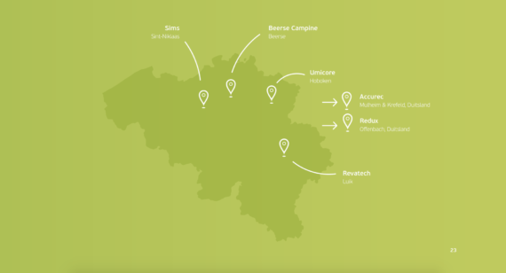
Geographical

Comparisons
Comparisons are used to substantiate certain information in relation to each other. Depending on the amount of data, this may be displayed differently. Icons or illustrations help to show the context of the comparison.

Graphs
Graphs can be used to display large pieces of data visually. These can be different types of graphs such as a pie chart, bar chart, etc., depending on the information you want to convey.
Guidelines
The intention is for the infographics to translate Bebat’s style well. For this purpose, a number of guidelines have been drawn up that will help us to do this translation as well as possible.


